Design

The Queen's Gambit Has Me Yearning to Teleport to the Sixties

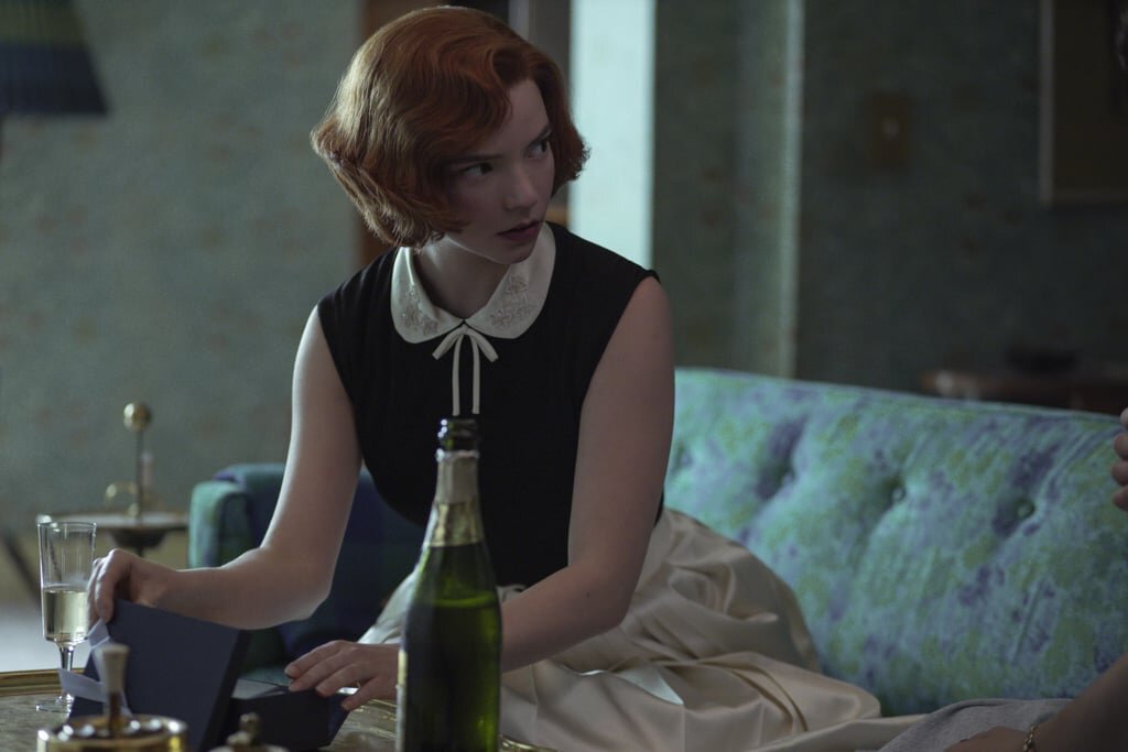
Anyone else binge watch the entire first season of The Queen’s Gambit on Netflix? Two episodes in and I was scrolling through saddle shoes on my phone; by episode 4 I’d set the table for chess date night (keep scrolling for the tablescape). From the clothes to the interiors, every episode is a feast for the eyes.

merlin_178097757_9dfc173d-c574-4a57-8695-a5cc643b98f9-mobileMasterAt3x.jpg

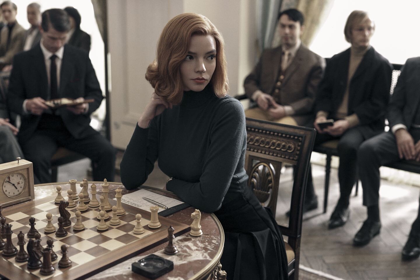
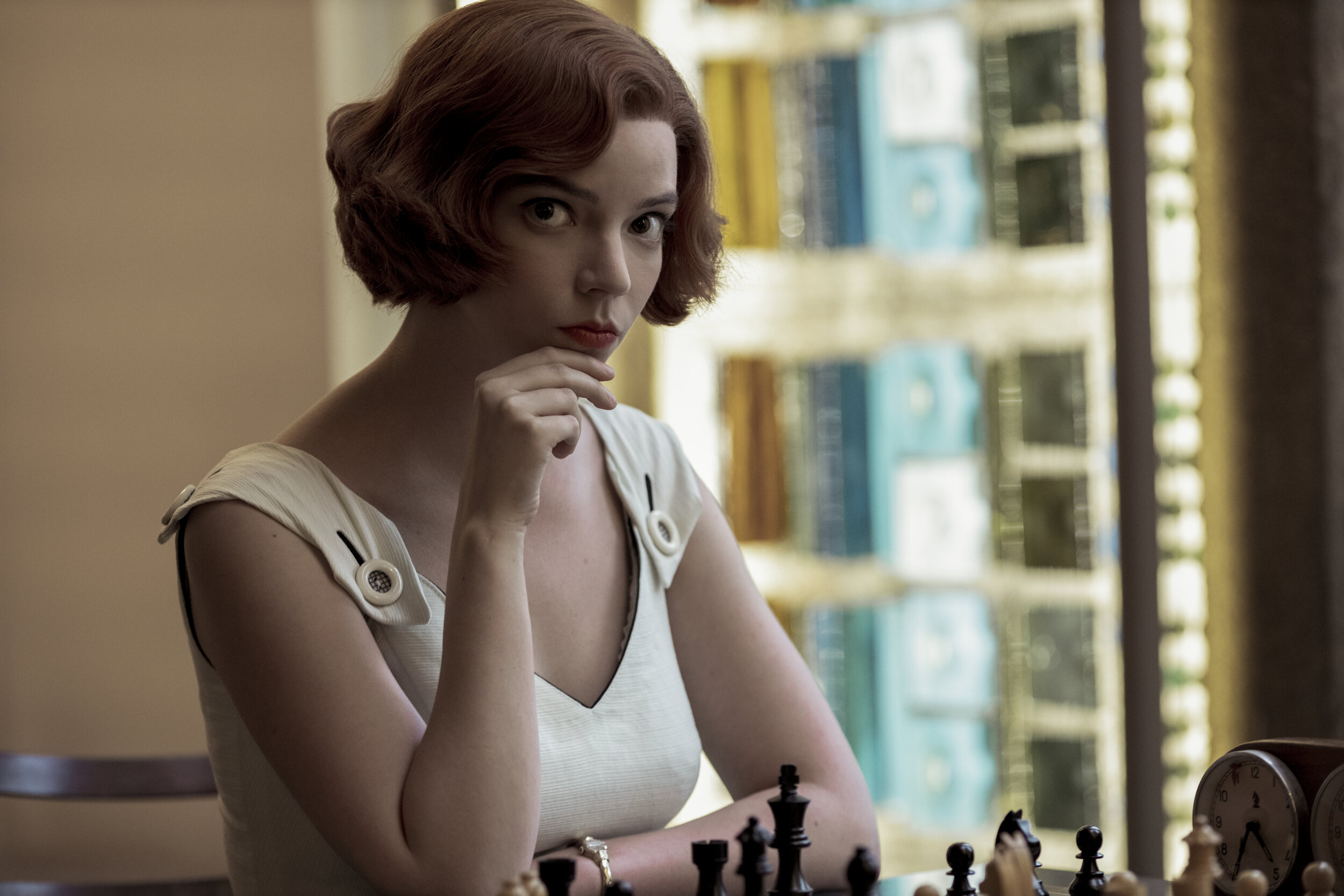
If you’re unfamiliar with the premise, orphaned chess prodigy Beth Harmon sets out on a quest to become the greatest chess player in the world (all while battling addiction). Never thought a show centered around chess would have me so enamored.

IMG_9129.JPG

The entire show is a love letter, not only to the game of chess, but to 60s fashion and design. There are some elements of 60s design I’m happy to report have faded away, like shag carpet, or the intermingling of orange and avocado green. But mid-century furniture has never been more popular, and other elements, like colorful patterns and wallpaper, are still beloved.

IMG_9126.JPG

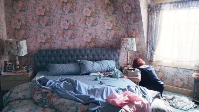
From her floral sofa to her effortlessly chic style, I’m taking notes, Beth Harmon…

-queens-gambit-fashion.jpg
-queens-gambit-fashion (1).jpg
IMG_9128.JPG
IMG_9125.JPG
the-queens-gambit-costumes-17-1.jpg

After yearning to teleport to a bygone era, I dug my husband’s beloved chess board out of our game trunk and went to work setting our table for a 60s inspired game night / date night — music playlist included.

My always chic boss Meg Lonergan gave me a gift card to The Avenue for my birthday, and I had a blast picking out a variety of fun new pieces, including the prettiest deck of cards I’ve ever seen in my life.

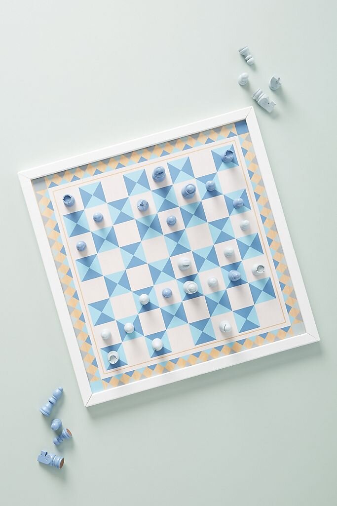
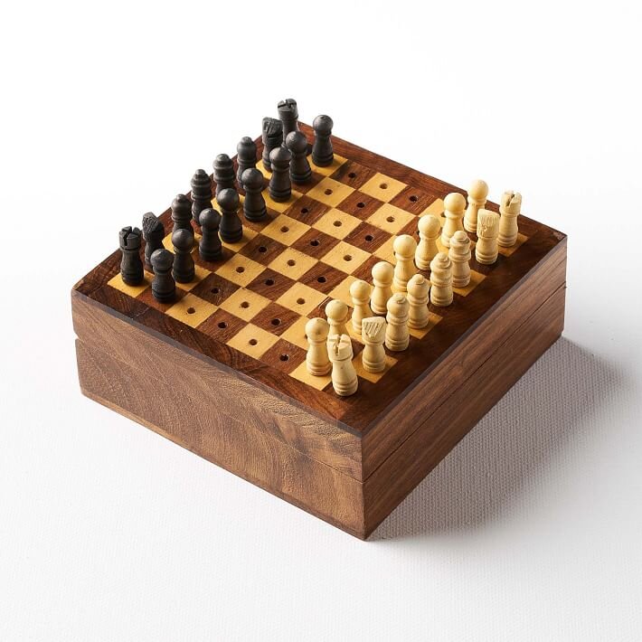
If you’re now inspired to try your hand at the classic game, I’ve rounded up some pretty sets to upgrade the one collecting dust in your game closet. Something for everyone! For the vintage-inspired chess player…

For the artsy chess player…

For the modern chess player…

For the chess player on the go…

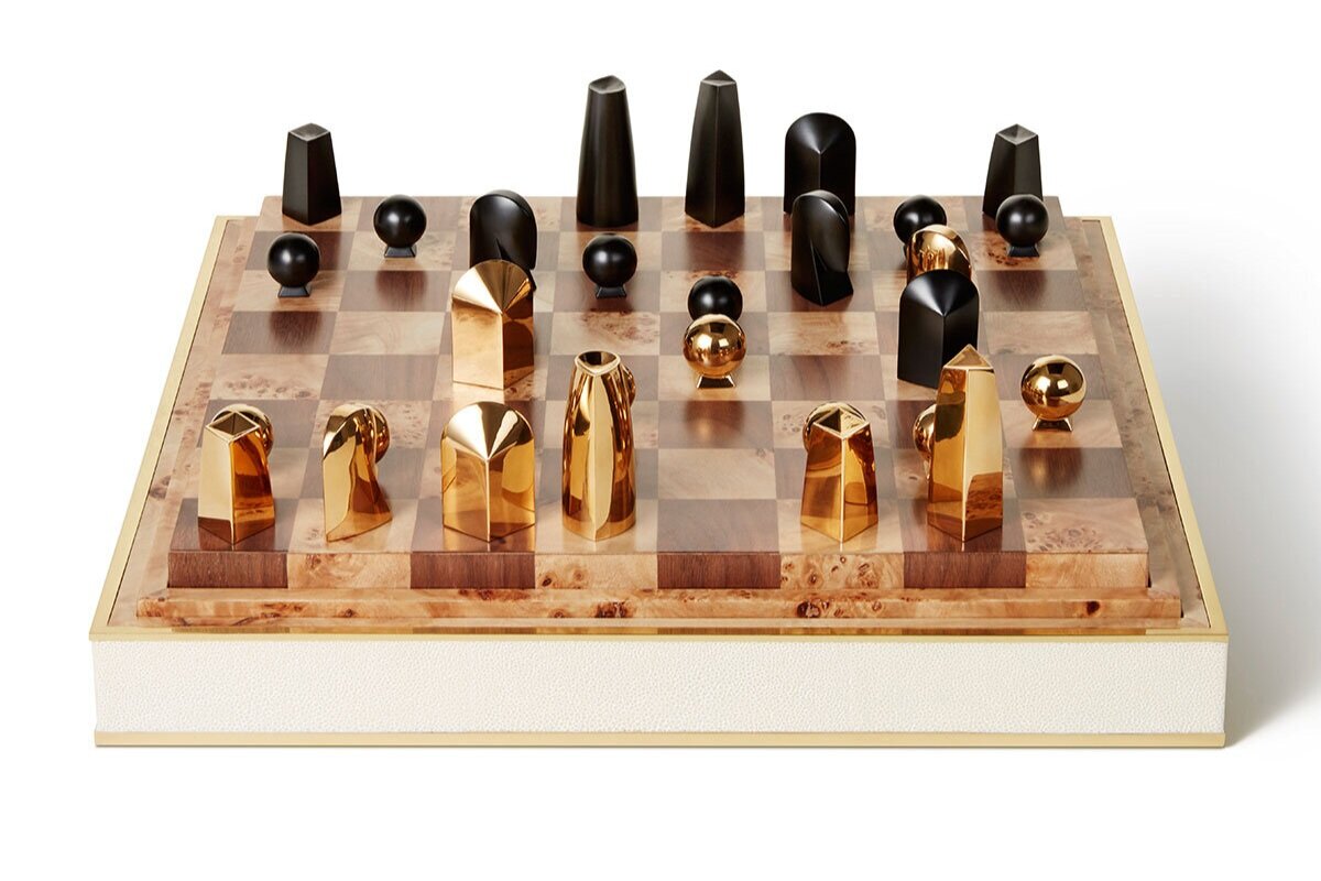
For the fancy chess player, with $3,250 burning a hole in their pocket…

For the slightly less fancy, but still quite fancy, chess player…

For the truly committed…

And lastly, the classic chess player…

[Graphic] Design Soulmate: Carter Tindall

IMG_1907.jpg

Small world story. Carter and I met at Wofford in 2011, where we were both members of the very small 'artsy' community on campus.  Flash forward two and half years after graduation. This past October, I find out some exciting news:

1. Carter is moving to Houston. (not a common Wofford grad destination!)

2. Carter will be working for my favorite graphic design firm in Houston, Principle. Which means...

3. Carter will be working in the same little brick building as me.

4. And Carter will be moving into an apartment down the street from me

Our lil shared brick building, which houses multiple creative minds like Milieu Magazine and  Hill Swift Architects. 

Our lil shared brick building, which houses multiple creative minds like Milieu Magazine and  Hill Swift Architects. 

I was overjoyed to have an old Wofford friend headed to my neck of the woods, but even more excited to have another design friend in the city with whom I could appreciate vintage furniture, velvet, art and good menu typography.

IMG_2545.jpg

She recently had me over for some cheese and an Aperol Spritz (or two) and told me more about her time at Miami Ad School at Portfolio Center in Atlanta, her favorite portfolio works, and what it's like to work for one of Houston's best graphic design firms. 

IMG_1898.JPG
IMG_1900.JPG

OKAY, I'M A LITTLE OBSESSED WITH YOUR 'HIGHWIRE' PROJECT. TELL ME MORE.

Highwire was my whiskey branding project. It started with a pencil in hand, paper and a love of sketching, and learning the intricacies of Victorian Lettering. This was followed by many, many more sketches...
 
01b3c356456383.59bb141fc5a61.jpg

WHAT WAS YOUR INSPIRATION? 

It was inspired by Charles Blondin, the most famous wire walker of the Victorian Era. On his first walk across Niagara Falls, he sat down on his cable and called for the Maid of the Mist to anchor beneath him. He cast down a line and hauled up a bottle of whiskey. He took a swig and began to run after he passed the sagging center. The design embodies the unique balance of precision and theater involved in the art of highwire walking.
dfe72856456383.59b6bcd709da7.jpg
PicMonkey Collage.jpg

WHICH PROJECT IN YOUR PORTFOLIO ARE YOU MOST PROUD OF?

The project I am most proud of is Frank’s Full Service. The assignment was to create a corporate identity, which seemed vague, but full of possibilities. I knew I wanted to do something totally out of my comfort zone that stood out amongst my other projects. Frank’s celebrates bright colors, bold typography, unique iconography, and an extensive set of collateral. 
98b70856545347.59b2a3d731793.jpg
Named after my dad, Frank’s is a full-service gas station that prioritizes quality workmanship and friendly service. The mission is to remind people of the past, and fuel them for the future. Whether you need gas, service, or refreshments, Frank’s Full Service will help you refuel.
c70b0e56545347.59b367cb6a3fa.jpg

TELL ME ABOUT YOUR RESTAURANT PROJECT, ABATTOIR.

Each student selected an art movement to drive the concept and inform the design aesthetic for their restaurant branding project. I selected Cubism. Through the study of Cubist paintings, I learned that Picasso turned to primitive art, specifically African masks, for inspiration. I used this idea—of turning something old into something new—to guide the ethos and the aesthetic of Abattoir. 
 

3e859c55704915.59a09c5892024.jpg
Nose-to-tail and root-to-stalk are modern trends, but their roots lie in the most primitive way of eating. Abattoir explores adventurous dishes to inspire a movement in which formerly discarded parts of animals are celebrated, and where nothing goes to waste.
a53d1155704915.59c27a53caa24.jpg
11cd7c55704915.59c27a53ca4a8.jpg

WHAT MADE YOU WANT TO PURSUE GRAPHIC DESIGN?

At Wofford, each student has the opportunity to spend the month of January on an interim—traveling, participating in an internship, or taking a class on campus. My senior year, I interned with my cousin, Leah Moore, a graphic designer in Atlanta and a Miami Ad School at Portfolio Center alum. Leah told me about her experience at Miami Ad School at Portfolio Center, and we took a quick drive to Bennett Street for a visit. I met with a few of the teachers, sat in on a class and, well, the rest is history.
Magazine concept: another one of Carter's portfolio projects.

Magazine concept: another one of Carter's portfolio projects.

WHAT ARE SOME OF YOUR FAVORITE PAST PRINCIPLE PROJECTS?

All of the Goode Company restaurants. The Principle team did an amazing job paying homage to the beloved Houston staple—refreshing the logo mark and creating an integrated brand system that ensures consistency between the various restaurant concepts. The typography palette for this brand system has such a unique mix that allows for endless typographic play and unexpected combinations. 
Located on bustling Kirby Drive, Armadillo Palace somehow still feels like a neighborhood bar. Principle describes it  as "a celebration of true Texas food, music and culture."

Located on bustling Kirby Drive, Armadillo Palace somehow still feels like a neighborhood bar. Principle describes it as "a celebration of true Texas food, music and culture."

ArmMaster1.jpg
BBQ_GoodeSauce.jpg
Colorful scheme for Goode Company's Kitchen & Cantina

Colorful scheme for Goode Company's Kitchen & Cantina

Orange Blossom Bar, located inside Armadillo Palace.

Orange Blossom Bar, located inside Armadillo Palace.

Here you can sip on some Texas-inspired specialty cocktails, like a Mexican Martini (made with tequila of course), or  some ice cold Texas Tea, made with a splash of Dr Pepper. 

Here you can sip on some Texas-inspired specialty cocktails, like a Mexican Martini (made with tequila of course), or  some ice cold Texas Tea, made with a splash of Dr Pepper. 

WHAT ARE YOU MOST EXCITED ABOUT?

I’ve had so much fun assisting in the brand creation for a Goode Co. Taqueria concept for Finn Hall, a food hall opening downtown Houston later this year. Stay tuned for breakfast tacos, make your own fajita kits, and a bold and bright color palette.
carter-tindall-at-desk-principlejpg.jpg

I'VE HAD A DESIGN CRUSH ON PRINCIPLE SINCE I MOVED TO HOUSTON. WHAT'S YOUR FAVORITE PART ABOUT WORKING FOR PRINCIPLE?

I mean if you really think about it, it’s so simple: I work with people I admire and respect on a wide range of projects I’m passionate about.  I have had the opportunity to work on projects for long-term clients like Goode Company and Brighter Bites—and some that are brand new, like the Houston Zoo and Hotel Amparo—A Hotel in San Miguel de Allende opening in the fall. 

Good news: you, too, can work for Principle (if you've got what it takes, of course). They're hiring.


Small world story. Principle's founder Ally is married to my husband David's boss, Randy, who co-founded Element Markets, an environmental compliance and sustainability firm. So my friend's boss' husband's employee is my husband. Ha! Not confusing at all. Principle designed Element Markets' branding, too. 

Wedding Details & Design

Photography by Amber Vickery

Photography by Amber Vickery

It's hard to believe how time is flying, but today marks two whole months of marriage. (Woo hoo!) I've said for a long time that if I hadn't pursued interior design, I might've been really interested in wedding planning. (Now, after planning a wedding of my own, I'm not so sure!) 

I wanted my dress to be simple and romantic. I fell in love with the subtle mocha undertones in the skirt and ribbon belt, and paired it with a delicate lace off the shoulder jacket. 

I wanted my dress to be simple and romantic. I fell in love with the subtle mocha undertones in the skirt and ribbon belt, and paired it with a delicate lace off the shoulder jacket. 

As much as I loved the design aspect of putting everything together, I learned that planning a large scale event is no walk in the park, people. For months my days were filled with design inspiration, ideas and decisions to be made. Colors and paper types and ribbons, oh my! 

The Bella Vista ceremony site overlooks the vast and breathtaking Texas hill country.

The Bella Vista ceremony site overlooks the vast and breathtaking Texas hill country.

As overwhelming as it was at times, I really enjoyed pulling together our mood board and sourcing other creative people to help bring our vision to life. We fell in love with the view (and people) of Rancho Mirando (pictured above), and the rest was history. Our coordinator Leslie and her mom Donna, our amazing florist, helped pull together the wedding of our dreams.

Wedding Inspiration.jpg

My biggest inspiration was the crest my dad watercolored for us (below). It's whimsical and romantic and sweet, and we knew immediately we wanted to use it throughout the wedding weekend, from the hotel gift bag tags to the happy hour cocktail napkins. I was also immediately drawn to anything with velvet ribbon, dusty blue, navy, ivory, blue sea holly, and sage. 

Invitation suite and photo by Michael Musser of Anticipate Invitations

Invitation suite and photo by Michael Musser of Anticipate Invitations

I had always dreamt of using a collection of vintage stamps. Michael pulled together the perfect blue grouping to adorn the sage, hand calligraphed envelopes. 

I had always dreamt of using a collection of vintage stamps. Michael pulled together the perfect blue grouping to adorn the sage, hand calligraphed envelopes. 

I've always had a thing for paper and typography. I've also always said that if I weren't an interior designer (or wedding planner), I'd be a graphic designer. Paper types and Pantone colors and fonts and kerning — I love it all. I thoroughly enjoyed working with Michael of Anticipate Invitations to bring our vision to life. I wanted my dad's crest to be front and center as a tag, wrapping the suite in a sage velvet ribbon. 

Invitation suite and photo by Michael Musser of Anticipate Invitations. Michael's dotted watercolor border perfectly encapsulated the romantic, whimsical feeling I was looking for, and the chamfered edges were the perfect finishing touch.

Invitation suite and photo by Michael Musser of Anticipate Invitations. Michael's dotted watercolor border perfectly encapsulated the romantic, whimsical feeling I was looking for, and the chamfered edges were the perfect finishing touch.

One of my favorite details from the whole wedding was the custom menu. The watercolor crest was printed on a vellum overlay, tied to the menu with a dusty blue silk ribbon. It was the perfect detail to complete the table settings. 

unnamed.jpg
The custom menus featured the crest printed on a vellum overlay, tied together with a silk ribbon.

The custom menus featured the crest printed on a vellum overlay, tied together with a silk ribbon.

Handmade plates made by Donna Aldred of Rancho Mirando sat atop moss chargers. Table numbers by a long time friend Grace Singstad of Grace Art Market.

Handmade plates made by Donna Aldred of Rancho Mirando sat atop moss chargers. Table numbers by a long time friend Grace Singstad of Grace Art Market.

We used my parents' antique settee at the head table for myself and David, and decorated it with moss "S" and "D" letters, to echo the moss chargers. 

We used my parents' antique settee at the head table for myself and David, and decorated it with moss "S" and "D" letters, to echo the moss chargers. 

Every other table had a lantern with a floral wreath to bring more candlelit ambiance into the space. Table numbers made by Grace Art Market showcased photos of us from ages 1 to 20.

Every other table had a lantern with a floral wreath to bring more candlelit ambiance into the space. Table numbers made by Grace Art Market showcased photos of us from ages 1 to 20.

Our almond vanilla cake adorned with velvet ribbon and florals. Cake by Sweet Treets out of ATX. 

Our almond vanilla cake adorned with velvet ribbon and florals. Cake by Sweet Treets out of ATX. 

Handmade vow books by Kelsey Carpenter with deckled paper, silk ribbon and hand calligraphy. 

Handmade vow books by Kelsey Carpenter with deckled paper, silk ribbon and hand calligraphy. 

We wanted to keep the program lighthearted and more casual to reflect who we are as a couple, since the ceremony was outside overlooking the Texas hill country, rather than in a formal church. 

We wanted to keep the program lighthearted and more casual to reflect who we are as a couple, since the ceremony was outside overlooking the Texas hill country, rather than in a formal church. 

Wedding photos of our parents and grandparents adorned the guest book table. 

Wedding photos of our parents and grandparents adorned the guest book table. 

David's childhood friend Peter Liddle wrote and performed a special song for us. 

David's childhood friend Peter Liddle wrote and performed a special song for us. 

We are so grateful to all of our vendors and parents for helping pull together such a special and magical night. It was just about as perfect as perfect can be. I mean...no amount of planning can prevent the weather from dipping to a crisp, windy 40 degrees, randomly, in the middle of April... (oh boy!) but we had the warmth and love of our family and friends to keep us warm. 

Incredible photos by Amber Vickery

Incredible photos by Amber Vickery

Our photographer Amber Vickery and videographers Juliane and Alex perfectly captured our (chilly) day, and we will treasure the memories forever. 

VENUE | Rancho Mirando

FLORALS | Donna Aldred of Rancho Mirando

COORDINATOR | Leslie Aldred Lambert of Rancho Mirando

VIP | Mariann Imber

PHOTOGRAPHY | Amber Vickery

INVITATIONS | Anticipate Invitations

VIDEOGRAPHY | Juliane & Alex

BAND | Royal Dukes

HAIR & MAKEUP | LucieMarie

TABLE NUMBERS & ESCORT CARDS | Grace Art Market